Ghost Cult Magazine Case Study
Overview
The goal was to redesign the existing Ghost Cult Magazine in order to more efficiently present the well written content and make it more engaging for the target audience. The magazine is a collection of reviews over anything heavy metal related. Many metal head writers came together to create a place where fellow metal heads can read about new albums, bands, festivals, books, interviews, and films in the heavy metal world. This is a niche target audience that’s usually drawn to a very unique, striking, dark visual aesthetic and does not get offended easily. *WARNING: Project does contain foul language, satanic references, and briefly discusses topics like death and sexual intercourse, not for the eyes of children.*
O.G. Magazine Analysis
Outdated layout and aesthetic
Doesn’t flow well, not consistent
Contrast issues in some areas
Unnecessary elements
Poor color choices
Cover does not read “ultimate heavy metal music review/ interview portal”
Typography choices aren’t relevant or appealing, outdated even awkward typesetting in some areas
Ragging issues with a lot of text blocks
Outdated, pixelated, arguably culturally appropriated logo (see below)
Overall just overwhelming magazine
Good written content and voice, although some spelling issues??
Uses a 2 column grid with ½” margins
Original Ghost Cult Logo
Original Ghost Cult Cover
A Pg from the Original Magazine
Logo Process
I redesigned the GC namestyle logo and below is my process of the logo, as well as, the brand colors used. The target audience is adults who are in the niche heavy metal scene and they do not get offended easily. The brand name literally is about death and cults. Their tagline, that I didn’t want to change, went well with the name, so that got to stay. I went with a blackletter typeface because it matches the overall dark gothic aesthetic the target audience is usually drawn to. The textured sans serif in the original logo is outdated and lacks personality. And, lastly, I flipped the ‘t’s upside down because why not? Little razzle dazzle, if you will.
Logo Sketches
New Ghost Cult Logo
Cover Sketches & Process
The feature article in the magazine was an in-depth review of The Album of the Month: The Atlas Moth. The American post-metal band, The Atlas Moth, was chosen by the GC writers and I decided the cover needed to be focused on the feature article so it can become a collectors item for people who are either fans of the band, or the band themselves can get some copies, and add a little prestige to their image. I had heard of actual atlas moths before so I decided to create custom illustrations for the band based on the unique wing pattern of an atlas moth. Since the magazine is about music I drew a few moths coming out of the skulls ear to represent sound. There is a bonus illustration on the inside that correlates. Keep scrolling.
Feature Article Illustration
The feature article is a written review of the album, so I placed the moth over the skull’s mouth. The skull represents the writer and the moth represents the band. The goal with the illustration was to help viewers connect the article to the cover and even tear it out.
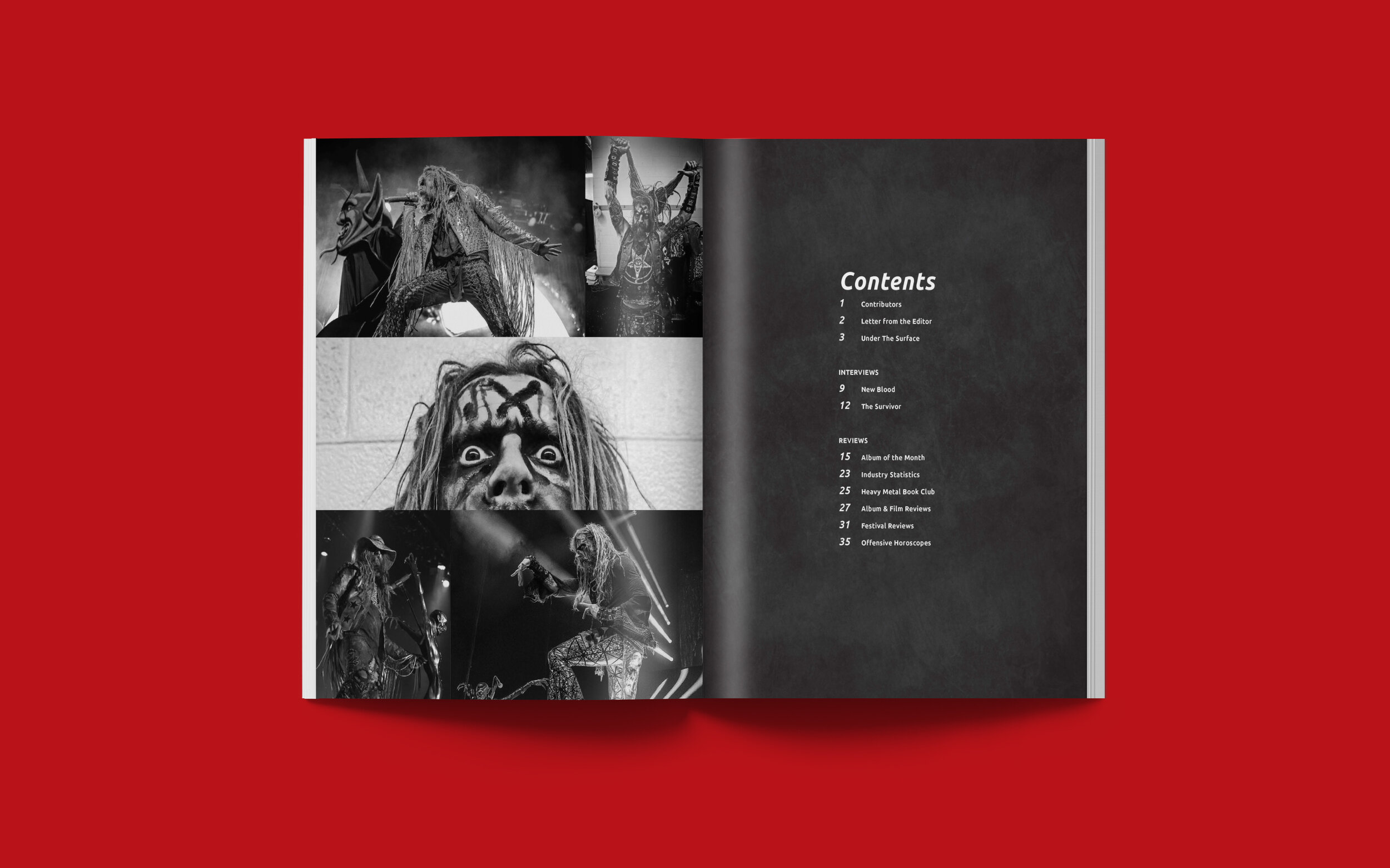
Table of Contents
Contributors & Letter from the Editor
Under the Surface Reviews
Under the Surface Reviews
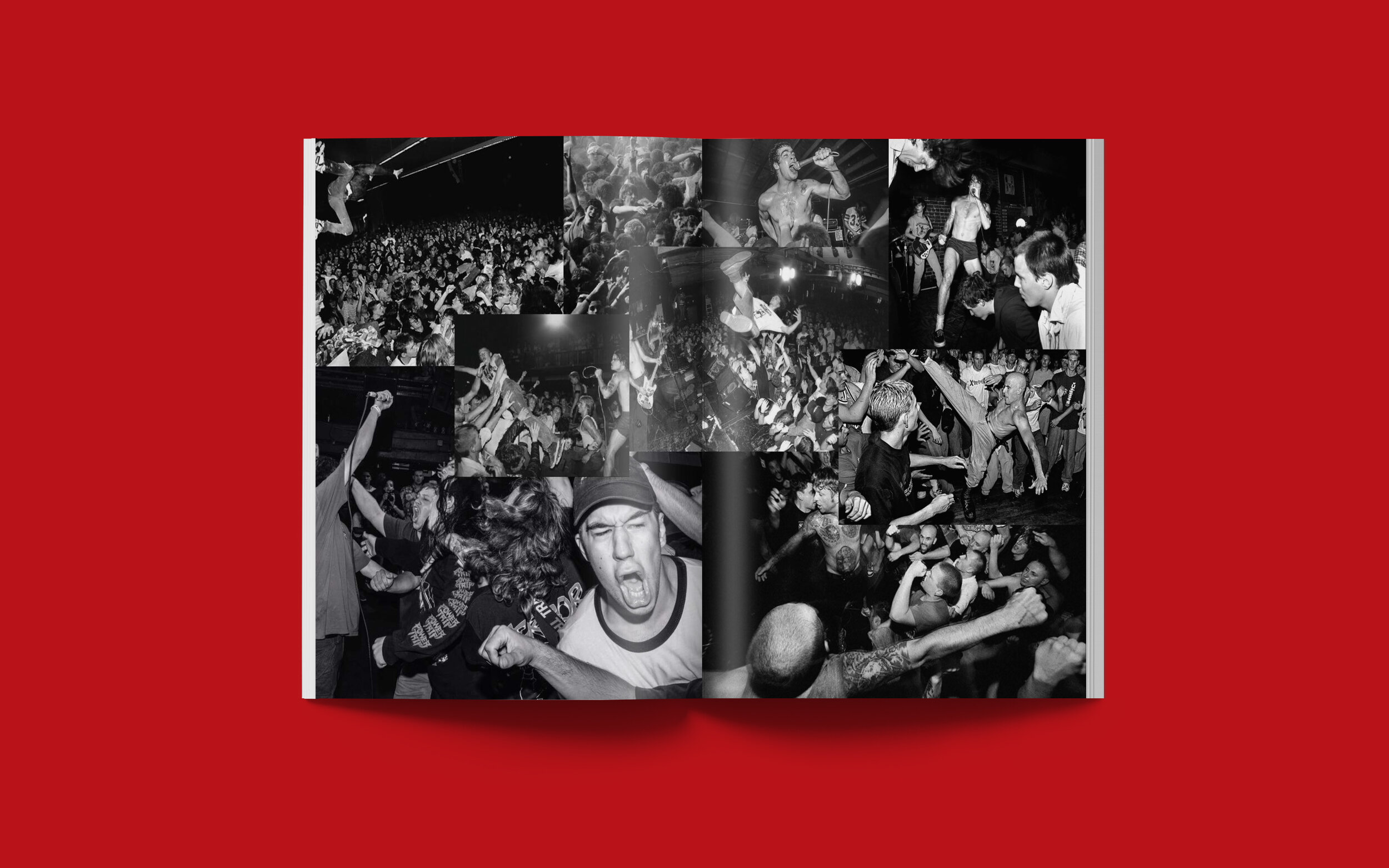
Live Metal Show
Album of the Month
Album of the Month
Industry Infographic
New Blood Interview
The Survivor Interview
The Survivor Interview
Heavy Metal Book Club
Album Reviews
Album Reviews
Metal Show Photos
Temples Festival Review
Scion AV Rockfest Review
Offensive Horoscopes
Copyright Statement
The executions shown were created for a class project, with no affiliation to Ghost Cult Magazine.
All images, logos, products, videos, and other copyrights or trademarks featured, mentioned, or referred to within the project are the property of Ghost Cult Magazine. The use of the trade name, copyright, or trademark in my student portfolio is for identification and reference purposes only and does not imply any association with the copyright or trademark holder of their product or brand. My work is not affiliated, associated, authorized, maintained, sponsored, endorsed by, or in any way officially connected with these copyright or trademark holders. Ghost Cult Magazine does not sponsor or endorse any of the shown work. I declare no affiliation, sponsorship, nor any partnerships with any copyright or trademark holders.


